Artha Fund
Visual ID
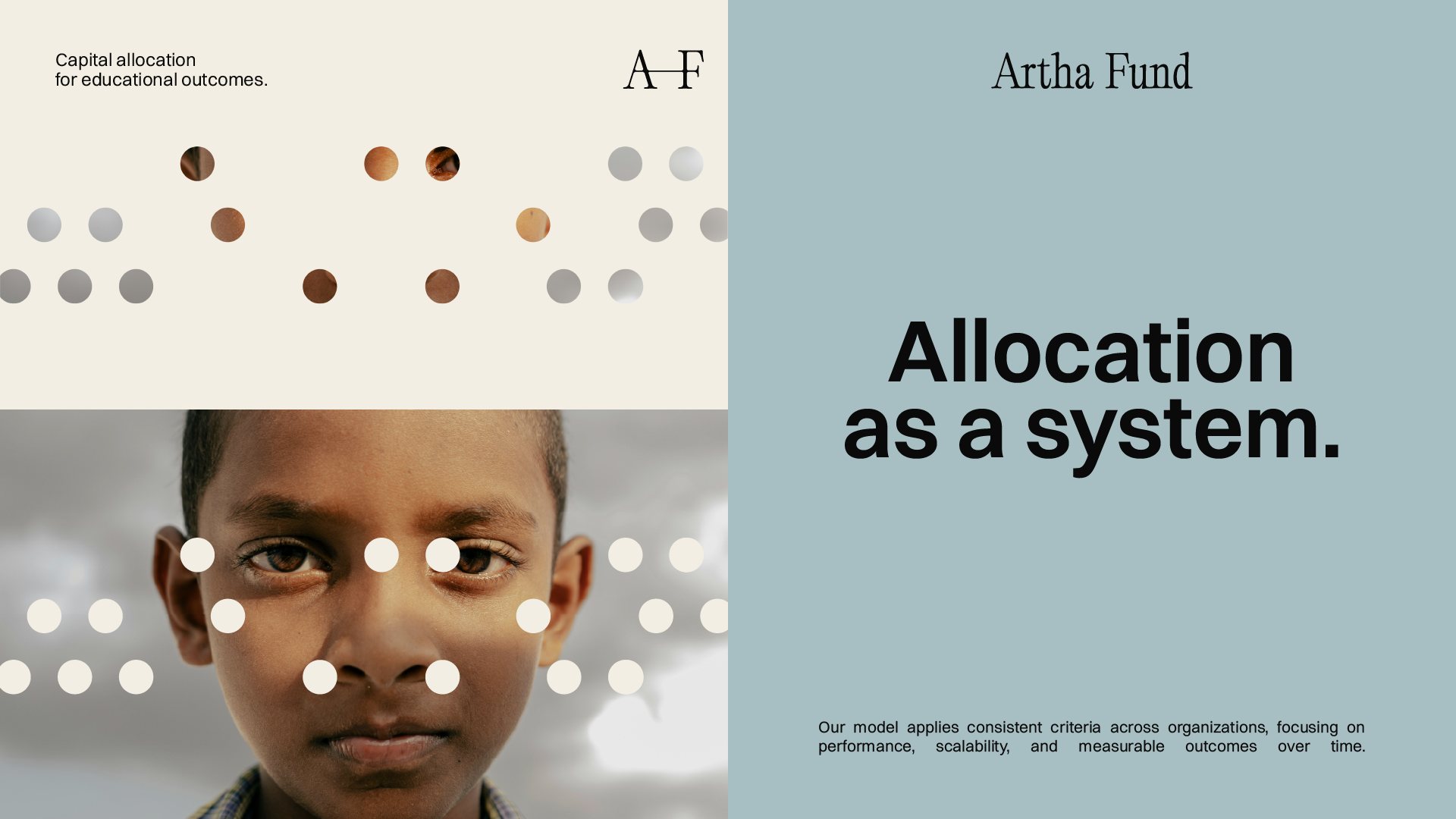
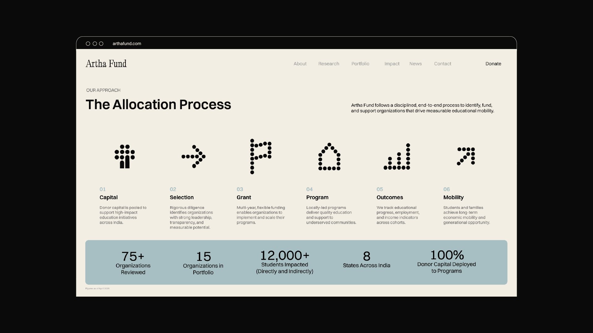
Artha Fund backs locally led education organizations in India, measuring success by what truly changes lives: careers, income, and economic mobility. Its name comes from the Sanskrit word for wealth and purpose. In a sector that often leans on emotional charity stories, Artha chose rigor and transparency instead. And so, we wanted everything to communicate trustworthy, human, and quietly ambitious. We set out to create a visual identity with the weight of an institution and the warmth of the people it serves, built on deep burgundy and black, softened by mineral neutrals and touches of muted gold.
INDUSTRY
Charity & Grantmaking
LOCATION
US & India